Thursday, 23 November 2017

Making a magazine front cover 1


Evaluation:

Use of the image - I decided to use this image due to the composition being the most popular and general camera view for people centred magazines. The model is also looking into the camera which is a meta or self referential code due to the acknowledgement that an audience is reading the magazine. I find that this increased the interactivity between the magazine and reader. The model is an explicit code of a college student, wearing a college lanyard, a hoodie and is young in age, these all combine to form an indexical sign of a college student. The target audience would clearly be able to understand the context and topic of the magazine from this, thus increasing its appeal to the target audience, young teenagers looking into college or requiring information for college in general.

The font I used in the magazine front cover is Adventurer Black SF. A convention of modern magazine covers are large, bold, sans serif fonts in order catch the readers attention and seem modern; the convention of modern being clean, crisp, relatively simplified and monochrome. I followed this convention as I feel to a target audience, that are going into generally new, modern colleges this might appeal more than artistically fluid fonts due to the magazine cross referencing with modern colleges and their designs.

In the features I included top and bottom designed borders that avoided touching the model as much as possible to keep the image of the model as the larger selling point of the magazine. I included said model in order to attract the attention of the target audience. I also used a large masthead in order to clearly state the category of the magazine cover. I decided to use red as a code for the magazine due to the model being quite warm in lighting, and that red is quite a striking colour which appeals more to the younger audience due to younger people being more entertained or interested in bright colours rather than dull or quiet colours. This also links to the fact that the magazine is intended to be quite modern and modern is the idea of new.

The masthead of the magazine is clean and of a conventionally followed idea of modernism. I feel this would apply to the target audience because it explicitly states the grouping of the magazine, education, and is specific. The magazine is aimed for utilisation, it is not an entertainment magazine as it is intended to inform the audience. I find that informing magazines are more likely to appeal to the target audience as it doesn't have to jump through holes to appeal to the audience in terms of entertainment, but is merely meant to teach and give information, facts and knowledge which thus should not contain an opinion and therefore is less likely to have an opposed reading.


Tuesday, 14 November 2017

Coca-Cola's utopia advertising


In Coca Cola ads the American life is portrayed as a bright familial style of life with bright posters and videos, and joyful and positive attitude. Coca cola does not seem to portray the all American life as positive but instead promotes becoming happier enforcing sharing, family, friendship and equality in their advertisements; as such all advertisements have people represented in that manner or having been planned to inspire positivity.


To British teenagers, this ideology might be widely attractive due to the general mainstream stereotype of Britain being gloomy with bad weather and cold, it is also backed up by roughly a 70% increase of mental health in teenagers in the UK. To a teenager in Britain, this idea of family, friendship, good weather and happiness would seem very enticing due to the large percentage of mentally ill teenagers probably wanting a better life for themselves and this idea from the Coca Cola advertisements would most definitely be interesting to them.


Coca Cola is known for breaking cultural differences, supporting equality and 'loving thy neighbor for what they are' such as the 'I'd like to buy the world a coke' and 'it's beautiful' advertisement'. Coke, being one of the largest fizzy drinks company worldwide, with a mass audience to advertise towards is too large for derogatory views to truly affect it; which means that the advertisements that create the views of pro diversity and equality still get shown and still affect the consumer in some form.

Some more examples of diversity and equality in coca cola adverts are:


Wednesday, 18 October 2017

Analysing magazines

Analysing magazines


Mise en scene – The first thing that draws attention is the character in the middle of the image and how the red and white contrasts with the blue background. While the gaming community is quite exclusive compared to news magazines, there is a large following; PlayStation has a large niche audience that has increased due to cross platform, the PlayStation now being utilized as more than a gaming console such as using the internet, watching tv etc.

The character is stood in front of the masthead which shows that the splash is a higher priority than branding. The character stands at a medium shot camera angle which creates an interesting and powerful pose that would appeal to the male audience who aren’t followers of the game or company franchise. This shows that the [1] representation of the character can interest viewers who aren’t knowledgeable of the franchise which is also an example of merging audience interests. [1] See Stuart Hall’stheory of representation.
In the middle of the magazine is the splash, they have used the logo of the game as a title so that to those who recognize the logo are interested and so that the interesting title draws outsider audience in. They have also sensationalised the standfirst by using the term ‘Everything you need to know about PS4’S #1 game!’ this creates the ideology that the game is of high quality and worth reading about. This is also seen through the name CoryBarlog, to those that do not even recognise the game, it still shows that the splash is of high importance by including a person on the front cover. To those that do recognise Cory Barlog, who is the creative director of Sony Entertainments, interests them because of their appreciation for him.
On the left side of the page is a contrasting section that interests the viewer because of the colours and the bright text. This advertises the game presented, the Gran Turismo sport. Below that is the exclamation of being a ‘world exclusive’ which creates the idea that this is exclusive to the viewer and the idea that this is theirs which appeals to the instinct of claiming objects and owning things.


On the other side is what seems to be the off lead of the magazine which lists two separate types of subjects into one story. Because of the magazines niche audience, it is obvious that the names of these games would have a reputation towards them however without actual images it is not advertising towards outside audience, this means that the magazine is relying completely on the splash to draw in new readers. This means that other stories on the front cover would only interest those with knowledge of their reputation.

Friday, 22 September 2017


History of the magazine


Johann Von Rist
The first recording of the magazine was a german literary and philosophy magazine called 'Erbauliche Monaths Unterredungen'.
Written in the 1600s (1663 untill 1668 to be exact) this is considered the first of the popular magazine we know today. It was mostly written by Johann Von Rist, a theologian and poet, the magazine contained a narrow scope for the readers and only lasted five years before it promptly stopped production. Considering how todays magazines and newspapers have been around since the 1920s this was not a long production period for a magazine.

The first widely read magazine however was 'The gentleman's magazine' published in 1731 London and was the first general interest magazine. Edward cave who edited the magazine was the first to use the term magazine. 


The first illustrated magazine however was the 'Illustrated London News' founded by Herbert Ingram in 1842. Magazines only really became popular in the 20th century due to the recently new mass production line from large companies such as Ford in America. Magazines swept entire countries becoming popular in the thousands in subscriber count and some even entered the millions in sold magazines. The 1920s were the age of Mass media which would come to control the hopes of the public in the events of war. Thanks to the rapid expansion of national advertising, the cover price decreased to about 10 cents. One cause was the heavy coverage of corruption in politics, local government and big businesses namely by mudcrackers. Mudcrackers were journalists who wrote for largely popular magazines to expose political sins and corruption as well as scandals; of which at this time it mainly focused on the scandals of the governments instead of what we know to day with scandals in 21st magazines. Mudcracking writers, for 'Mc clure's' notably focused on cooperate monopolies and political crooks.

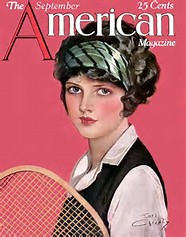
Another new development for magazines in the 1920s were women's magazines which came to surface after selections of women rebelled against tradition, namely flappers. Flappers were women that had cut their hair short, smoked, drank, went out at night without a male escort and took part in the illegal speak easies so it would be no surprise when women's magazines appeared on the shelves of the American stores. Wome's magazines set a trend and social statement for young women which helped to break the traditional victorian morales. Women who had broken away, namely famous women such as magazine writer Lois Long, a widely respected female head of the cooperate magazine business, and Clara Bow an on-screen star.

Magazines have changed drastically since the 1600s and 1920s and physical paper copies are declining due to the increasing producttion and use of digital devices and digital media. In 2011 152 magazines ceased operations, in 2012 82 magazines were closed down. However between 2008 and 2015 227 magazines were launched and in 2014 93 new magazines started production and only 30 closed.

Tuesday, 12 September 2017


Forms of media

.Printed media
An example of printed media
-Hard copy versions such as newspaper articles magazines posters etc  that are considered traditional forms of media

.Television
-Media is shown through advertisements, live news etc which people  experience through electronics. Motion picture is one of the oldest  forms of media and has high impact on younger audiences.

.Radio
-Like television radio has a huge impact on the audience through a lot of  advertisements, intel on news such as music, people, jobs etc.


------
Sources:
https://www.mentalhelp.net/articles/types-of-media/
http://www.sparknotes.com/us-government-and-politics/american-government/the-media/section2.rhtml